Java AWT Layouts
The java.awt library provides 5 basic layouts. Each layout has its own significance and all of them are completely different. Here in this article, we will discuss how to apply any layout to a frame or a panel and also discuss about each layout in brief.
The 5 layouts available in the java.awt library are:
- Border Layout
- Grid Layout
- GridBag Layout
- Card Layout
- Flow Layout
1. Border Layout
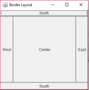
The BorderLayout is a layout which organizes components in terms of direction. A border layout divides the frame or panel into 5 sections – North, South, East, West and Centre. Each component can be arranged in a particular direction by passing an additional argument.
package com.mkyong;
import java.awt.BorderLayout;
import java.awt.Button;
import java.awt.Label;
import javax.swing.JFrame;
public class BorderLayoutExample extends JFrame {
    public static void main(String[] args) {
        BorderLayoutExample a = new BorderLayoutExample();
    public BorderLayoutExample() {
        setVisible(true);
        setDefaultCloseOperation(EXIT_ON_CLOSE);
        BorderLayout b = new BorderLayout();
        setTitle("Border Layout");
        setSize(300, 300);
        add(new Button("North"), BorderLayout.NORTH);
        add(new Button("South"), BorderLayout.SOUTH);
        add(new Button("East"), BorderLayout.EAST);
        add(new Button("West"), BorderLayout.WEST);
        add(new Button("Center"), BorderLayout.CENTER);
Output
2. Grid Layout
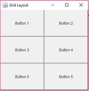
A GridLayout is a more organized way of arranging components. It divides the frame or panel in the form of a grid containing evenly distributed cells. Each component get added to a particular cell. The order of placement of components is directly dependant on the order in which they are added to the frame or panel. The below image shows a 2 column 3 row GridLayout based Frame.
The arguments of the constructor GridLayout(int row,int cols) decide the grid size.
package com.mkyong;
import java.awt.Button;
import java.awt.GridLayout;
import javax.swing.JFrame;
public class GridLayoutExample extends JFrame {
    public static void main(String[] args) {
        GridLayoutExample a = new GridLayoutExample();
    public GridLayoutExample() {
        setVisible(true);
        setDefaultCloseOperation(EXIT_ON_CLOSE);
        GridLayout g = new GridLayout(3, 2);
        setLayout(g);
        setTitle("Grid Layout");
        setSize(300, 300);
        add(new Button("Button 1"));
        add(new Button("Button 2"));
        add(new Button("Button 3"));
        add(new Button("Button 4"));
        add(new Button("Button 5"));
        add(new Button("Button 6"));
Output
3. GridBag Layout
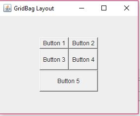
The GridBagLayout is the most flexible layout which provides an organized yet flexible way to arrange components. It provides developers with the flexibility to choose the exact location of the component, in a grid, it’s row span and column span as well as the horizontal and vertical gap. The below image shows a GridBagLayout. It contains Button 5 which spans 2 rows at a time.
package com.mkyong;
import java.awt.Button;
import java.awt.CardLayout;
import java.awt.FlowLayout;
import java.awt.GridBagConstraints;
import java.awt.GridBagLayout;
import javax.swing.JFrame;
public class GridBagLayoutExample extends JFrame {
    public static void main(String[] args) {
        GridBagLayoutExample a = new GridBagLayoutExample();
    public GridBagLayoutExample() {
        setSize(300, 300);
        setPreferredSize(getSize());
        setVisible(true);
        setDefaultCloseOperation(EXIT_ON_CLOSE);
        GridBagLayout g = new GridBagLayout();
        GridBagConstraints gbc = new GridBagConstraints();
        setLayout(g);
        setTitle("GridBag Layout");
        GridBagLayout layout = new GridBagLayout();
        this.setLayout(layout);
        gbc.fill = GridBagConstraints.HORIZONTAL;
        gbc.gridx = 0;
        gbc.gridy = 0;
        this.add(new Button("Button 1"), gbc);
        gbc.gridx = 1;
        gbc.gridy = 0;
        this.add(new Button("Button 2"), gbc);
        gbc.fill = GridBagConstraints.HORIZONTAL;
        gbc.ipady = 20;
        gbc.gridx = 0;
        gbc.gridy = 1;
        this.add(new Button("Button 3"), gbc);
        gbc.gridx = 1;
        gbc.gridy = 1;
        this.add(new Button("Button 4"), gbc);
        gbc.gridx = 0;
        gbc.gridy = 2;
        gbc.fill = GridBagConstraints.HORIZONTAL;
        gbc.gridwidth = 2;
        this.add(new Button("Button 5"), gbc);
Output
4. Card Layout
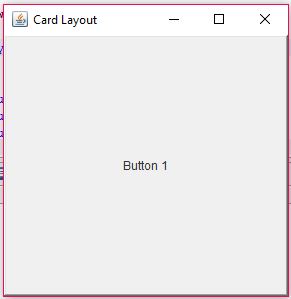
This is the layout which is rarely used and is utilized to stack up components one above another. The CardLayout allows components to stay over one another and switch any component to the front as per the requirement. Describing Card layout using a picture would make no sense. Hence, let us understand it with a small example. Consider the code below:
mychoice.addItemListener(new ItemListener() {
         public void itemStateChanged(ItemEvent e) {
            CardLayout cardLayout = (CardLayout)(e.getTarget().getParent().getLayout());
            cardLayout.show(panel, (String)e.getItem());
      });
The above code is associated with as an event listener with a combo box. As per the change in value of the combo, the component gets shown. In order to create a card layout, you can use the below code
package com.mkyong;
import java.awt.Button;
import java.awt.CardLayout;
import javax.swing.JFrame;
public class CardLayoutExample extends JFrame {
    public static void main(String[] args) {
        CardLayoutExample a = new CardLayoutExample();
    public CardLayoutExample() {
        setVisible(true);
        setDefaultCloseOperation(EXIT_ON_CLOSE);
        CardLayout g = new CardLayout();
        setLayout(g);
        setTitle("Card Layout");
        setSize(300, 300);
        add(new Button("Button 1"));
        add(new Button("Button 2"));
        add(new Button("Button 3"));
        add(new Button("Button 4"));
        add(new Button("Button 5"));
        add(new Button("Button 6"));
Output
5. Flow Layout
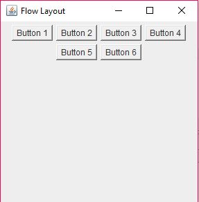
As the name indicates, FlowLayout is the layout which allows components to flow to and end of the visible part is reached. A FlowLayout basically helps develop more responsive UI and keep the components in a free flowing manner. The below image shows an actual flow layout with 6 components.
Since this is the default layout for a frame or panel, it can also work without applying the layout explicitly.
package com.mkyong;
import java.awt.Button;
import java.awt.FlowLayout;
import javax.swing.JFrame;
public class FlowLayoutExample extends JFrame {
    public static void main(String[] args) {
        FlowLayoutExample a = new FlowLayoutExample();
    public FlowLayoutExample() {
        setVisible(true);
        setDefaultCloseOperation(EXIT_ON_CLOSE);
        FlowLayout g = new FlowLayout();
        setLayout(g);
        setTitle("Flow Layout");
        setSize(300, 300);
        add(new Button("Button 1"));
        add(new Button("Button 2"));
        add(new Button("Button 3"));
        add(new Button("Button 4"));
        add(new Button("Button 5"));
        add(new Button("Button 6"));
Output
Conclusion
This article has discussed the available AWT layouts. The discussion has been done very briefly. Hence, there are some links provided in the references which might help you learn more.
References
- Layout details
- Using Border Layout
- Using Card Layout
- Using Flow Layout
- Using GridBag Layout
- Using GridBag Layout
From:一号门
Previous:Ant Create a fat jar file

COMMENTS